Other Projects & Creations


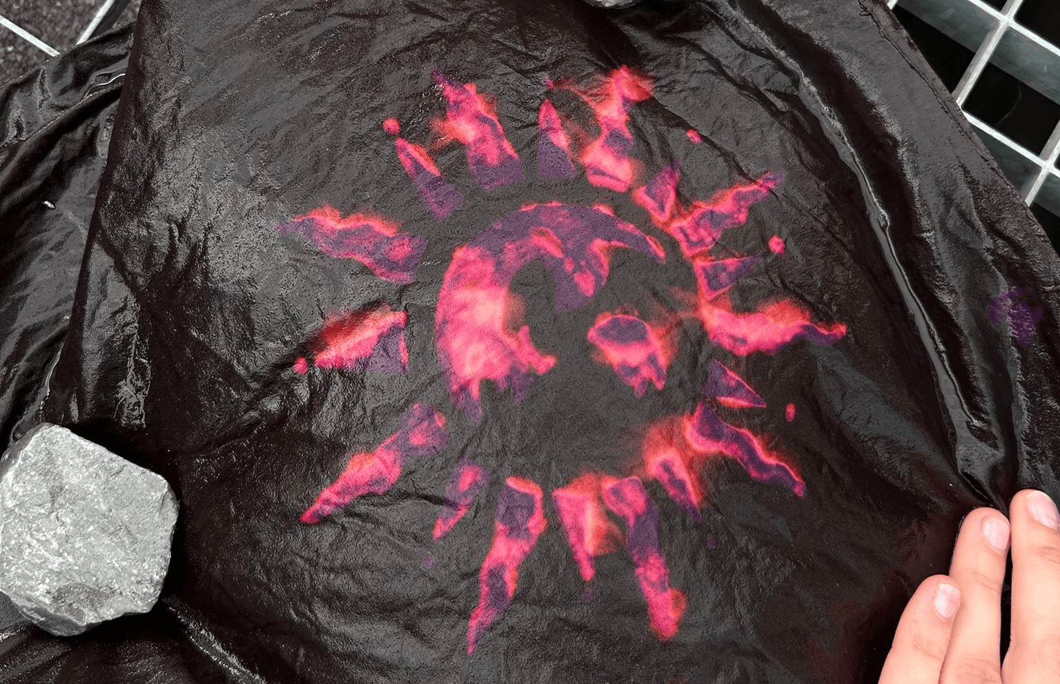
stencil printing.
This project was an exploratory venture into non-traditional textile printing techniques using natural and common materials. Our goal was to create unique patterns and explore color reactions on various fabrics.
The process began with designing and cutting cardboard stencils. For the printing medium, we combined pigments with Shellac as a natural binding agent and starch to achieve the desired viscosity. After printing the patterns onto the fabric,we utilized solar exposure for fixation and curing.
A key experimental phase involved the use of vinegar cleaner (or a similar acidic bleaching solution). We applied the solution to the printed areas and allowed it to dwell, initiating a chemical reaction that resulted in unique color shifts and textural variations. The final step was thoroughly washing out the fabric and letting it dry, yielding visually surprising and custom-dyed textiles.
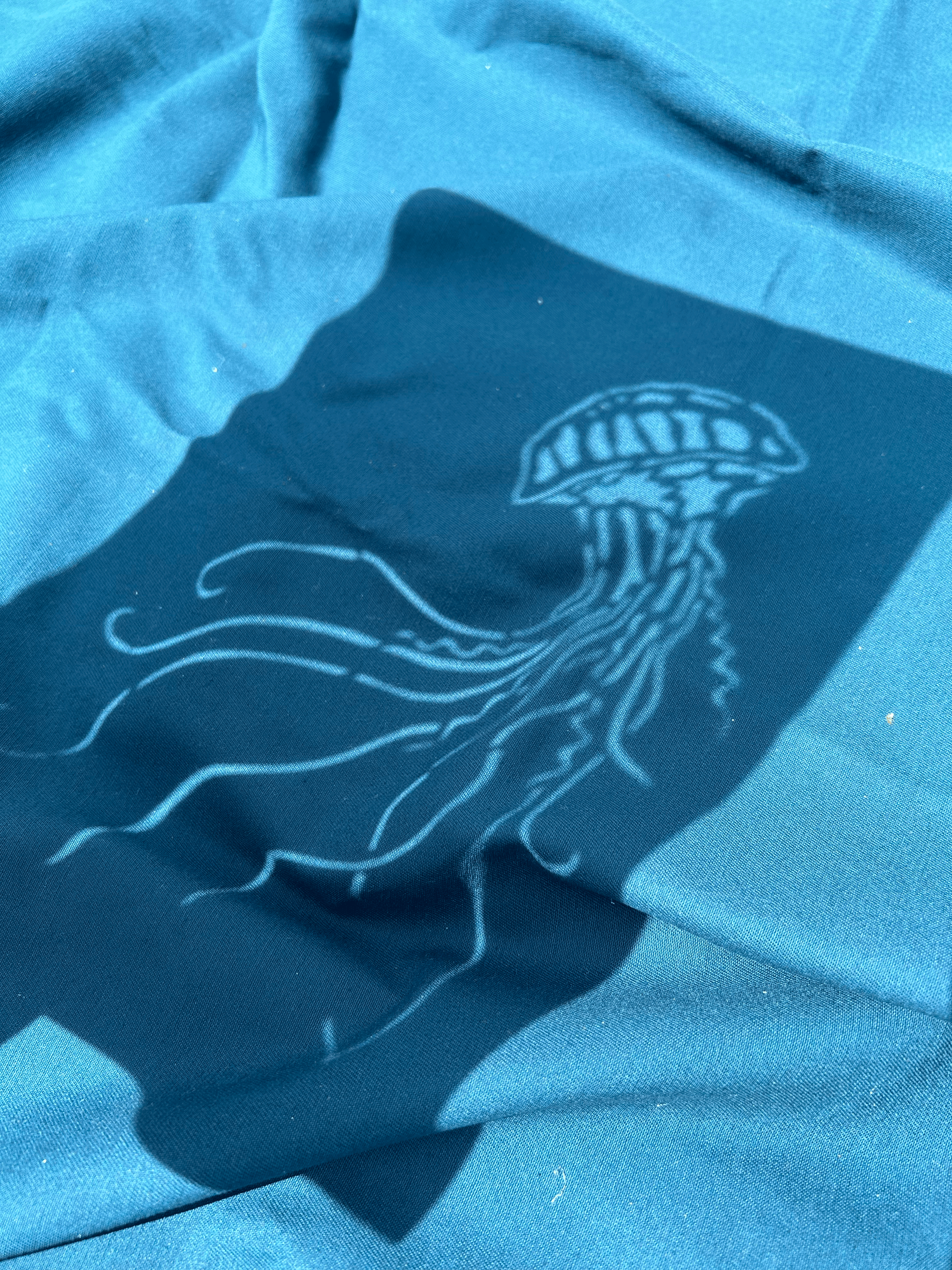
rachids kitchen.
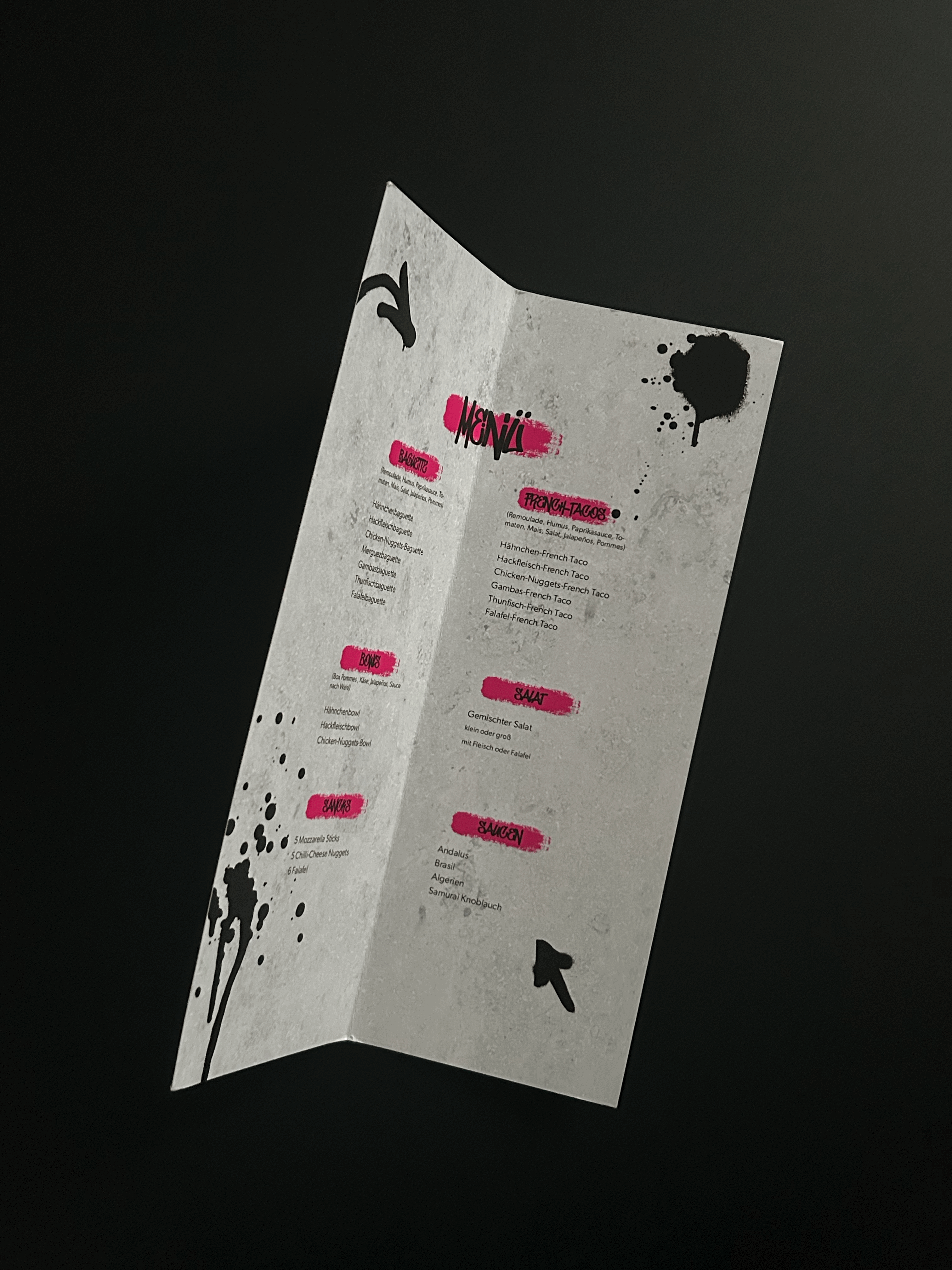
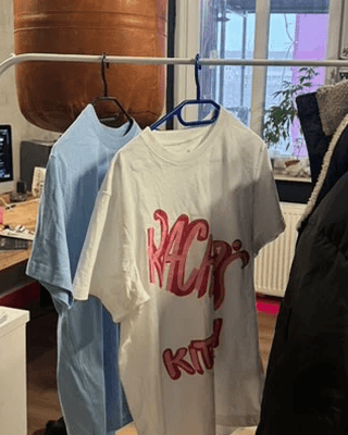

This project involved creating comprehensive print and merchandise design assets to support the visual identity of "Rachid's Kitchen." The goal was to develop a cohesive and recognizable design language that extends from the customer experience to the internal team presence.
My responsibilities included the design and finalization of several key branding elements. I created a professional and memorable design for business cards that reflect the restaurant's quality and aesthetic. I was also responsible for designing the restaurant menu, focusing on clear hierarchy, legibility, and an appealing layout that enhances the dining experience. Furthermore, I developed various designs for staff and promotional T-shirts, ensuring the designs are striking, align with the brand identity, and work effectively as wearable merchandise.
This work helped solidify the restaurant's public image and ensured a consistent design presence across all physical touchpoints.
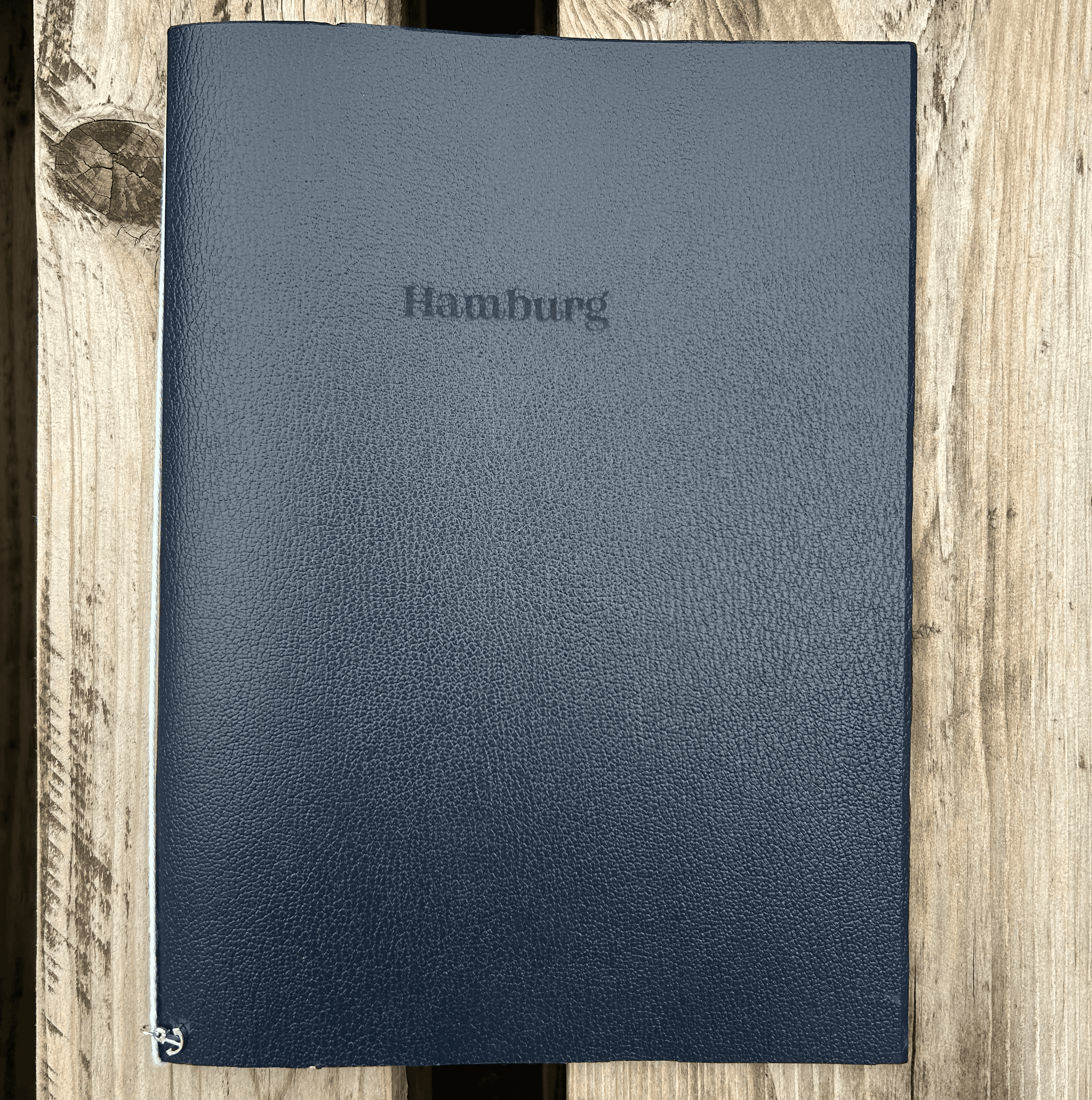
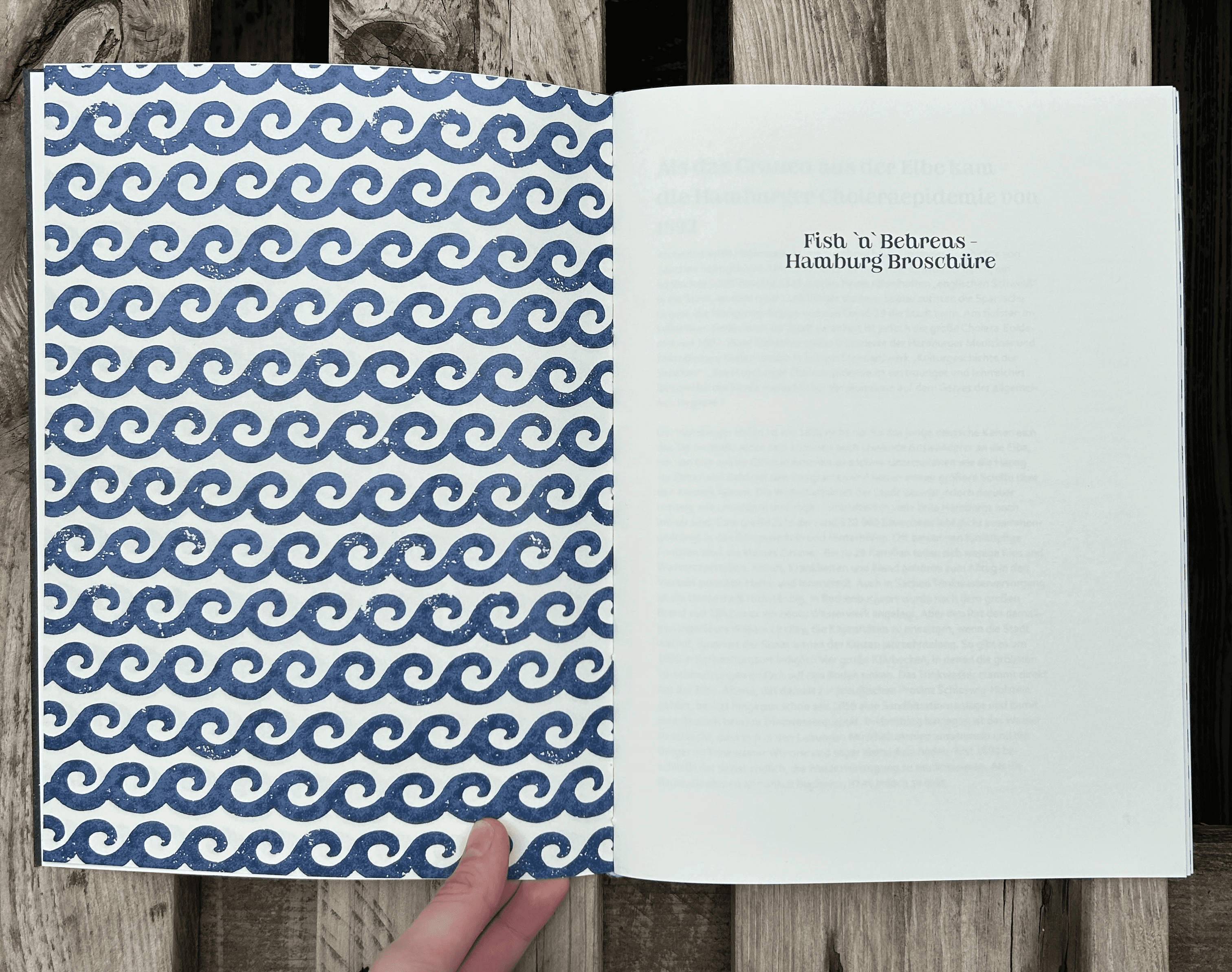
conceptual city brochure.
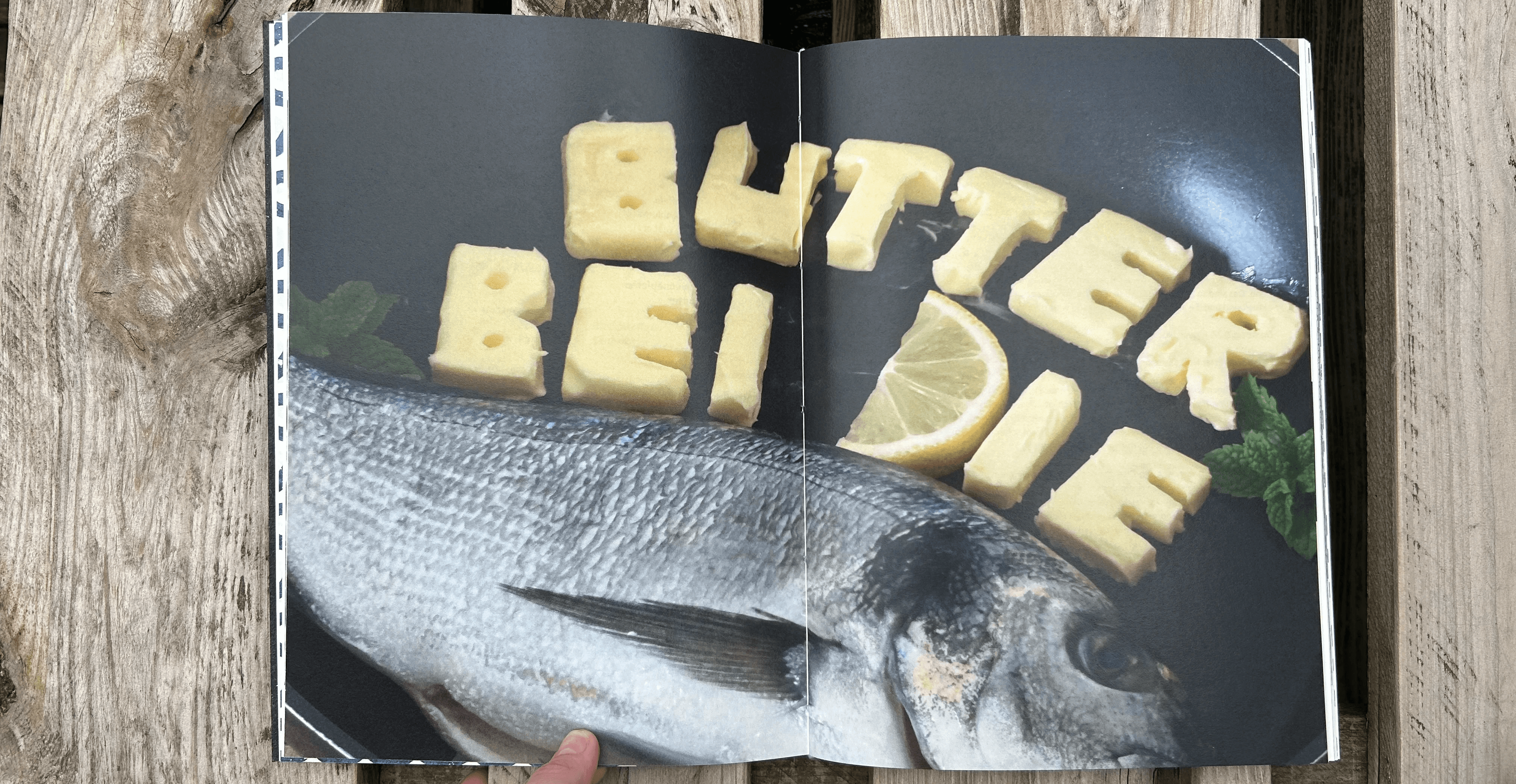
This conceptual project focused on designing an unconventional, multi-sensory city brochure for an assigned city, requiring us to move beyond standard informational formats. I was tasked with capturing the unique spirit and character of Hamburg, Germany.
The core of the project lay in its tactile and highly customized execution. The brochure’s cover was produced using leather-optic paper, onto which the city’s name, Hamburg, was laser-engraved, providing an immediate haptic connection to the design. A major highlight was the integrated poster: I used the famous local saying, "Butter bei die Fische" (Get to the point / Put your cards on the table), where the main typography was crafted from real butter and photographed, and the design incorporated an actual fish, creating a strikingly unusual and memorable visual.
For the typography throughout the brochure, I secured the exclusive permission to use a premium custom font designed by a local Hamburg agency, which lent the entire layout a sophisticated and authentic design foundation. Furthermore, the entire project, including the physical binding of the brochure itself, was executed by hand. This entire process — from material experimentation and physical typesetting to leveraging exclusive design assets and final production— demonstrated a commitment to extraordinary and impactful print design.